I have worked in graphic design so I’m sorry if I sound a little too nitpicky. I’m known for being a bit of a perfectionist with my clients
 Here is my much more detailed response/friendly critique that I didn’t have time to make earlier.
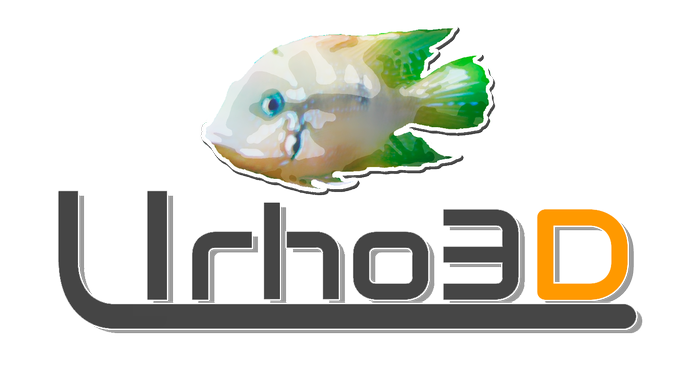
I think the Urho3D text needs to be moved further to the right more towards his tail. The fish and the text seem too bunched together. - Re-edit nvm
 I still think it would look good if they were more separated.
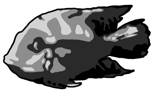
I also agree with cin’s previous suggestion that the fish silhouette needs a little more detail in the middle (see my suggestion below about using a tri-color scheme).
You have a great color scheme going there but I think the colors ultimately should all be used together for one logo rather than having a separate logo version for each color. Three colors is an ideal amount for a good logo in my opinion; anymore than that and it’s too busy and any less and it’s too dull.
One other thing that seems off to me is having the D be a separate color while the 3 is not. This could just me being too obsessive of course but Urho and 3D feel like they should have some form of separation from one another if you’re going to color one part of the “3D” portion and not the other. So I guess what I’m getting at is that to a reader it seems to flow better if it is all one color like this “[color=#0080FF]Urho3D[/color]” or more separated like this “[color=#0080FF]Urho[/color] [color=#00BF40]3D[/color]” - Just a note here I’m well aware that making it be two separate solid colors will look rather uninspired and cliche; that’s solely for example purposes. My suggestions on rectifying that are below)
The most important part of designing a logo is having it be pleasing to the eyes while being memorable and unique at the same time. Making the Urho and 3D part be two separate colors is not enough to achieve this. I think on of the following 3 things would look the best.
A. Taking the partial color of the “h” in “Urho” away and in it’s place partially coloring the 3 in “3D” some way to to blend it into the “D” in Urho3D
B. Make the “3D” in Urho3D actually be 3 dimensional text by using gimp or photoshop. (Very easy to do.)
C. Just keep it simple and make all of Urho3D be the same font and color and instead focus the graphic detail and color scheme on the fish only while retaining the glow and underline.
I forgot to say I love the way you blended the glowing effect into the underline and font colors; that was a very good idea which I love. I also have a little suggestion/idea to try related to that for the underlining
 How about rather than making the underline be so diagonal you instead connect the colored line to the outermost portion of the “U” in Urho and make it more of a solid color albeit with less contrast? By the way, the reason I mentioned that is that you don’t often see logo’s that use sharp diagonal designs. It does flow great but I think that a more standard design for the underline could be more appropriate in the case of Urho3D. I’d love to hear how others feel on that point.




 I still think it would look good if they were more separated.
 How about rather than making the underline be so diagonal you instead connect the colored line to the outermost portion of the “U” in Urho and make it more of a solid color albeit with less contrast? By the way, the reason I mentioned that is that you don’t often see logo’s that use sharp diagonal designs. It does flow great but I think that a more standard design for the underline could be more appropriate in the case of Urho3D. I’d love to hear how others feel on that point.


