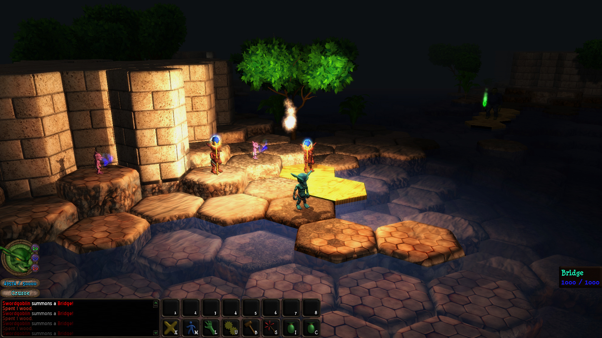
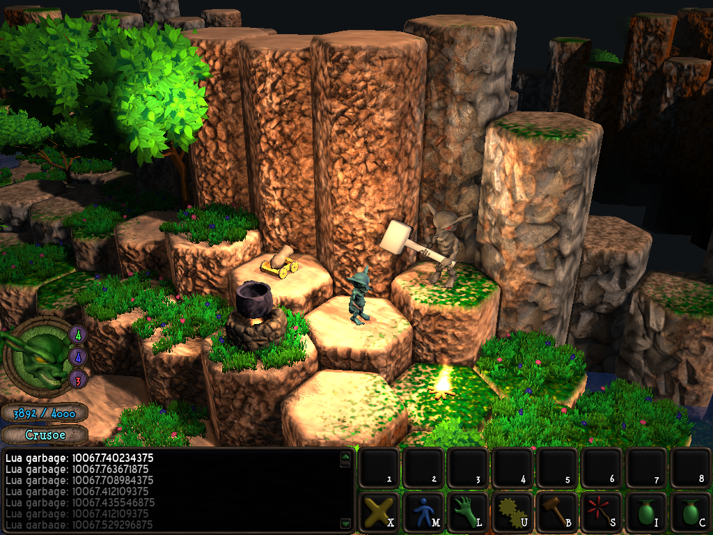
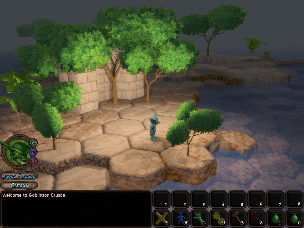
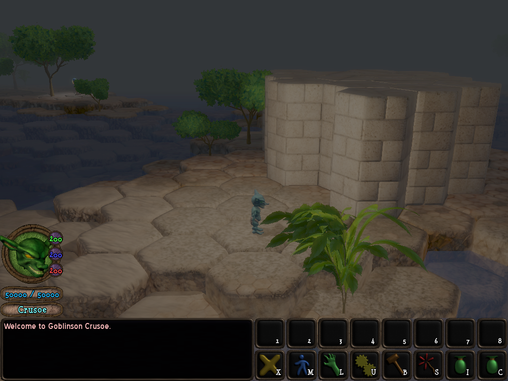
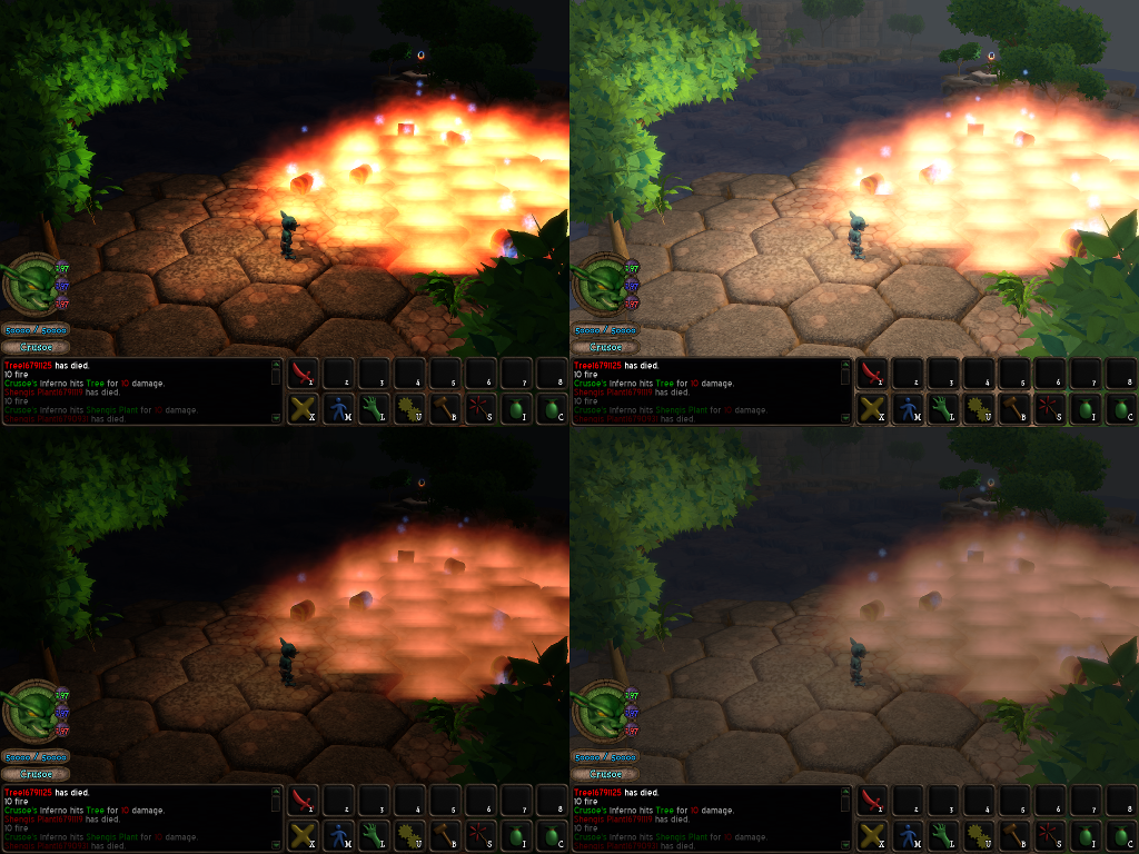
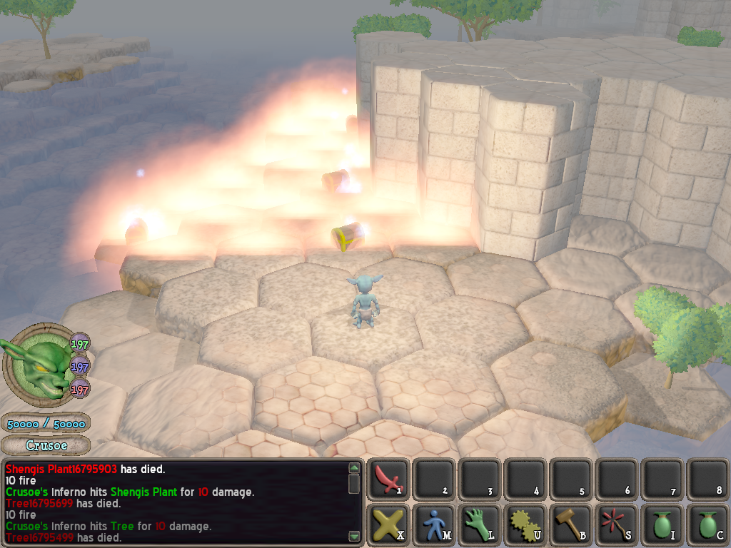
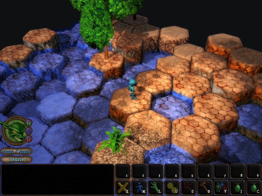
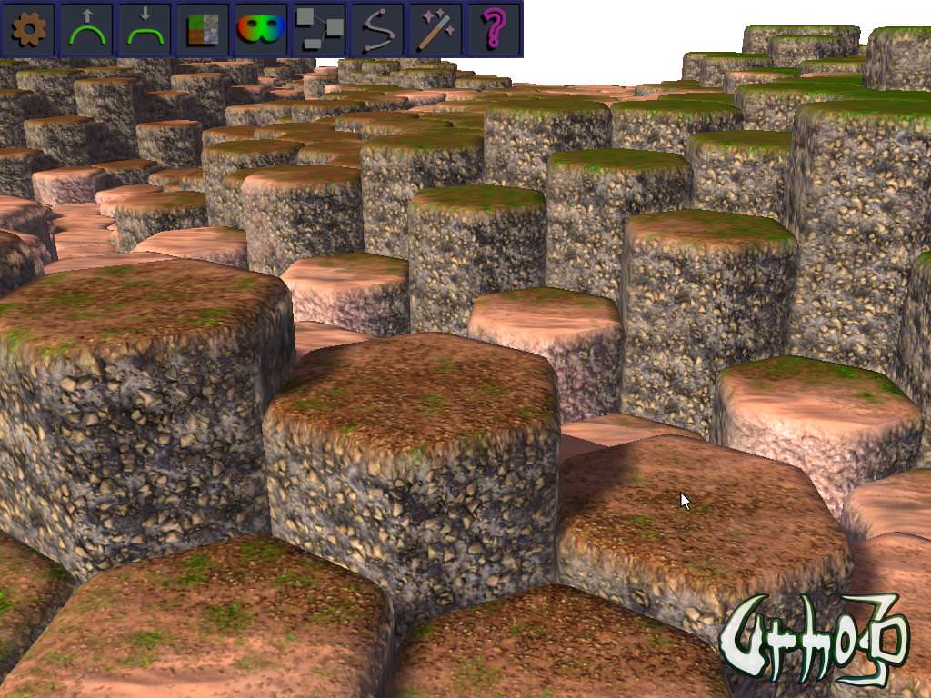
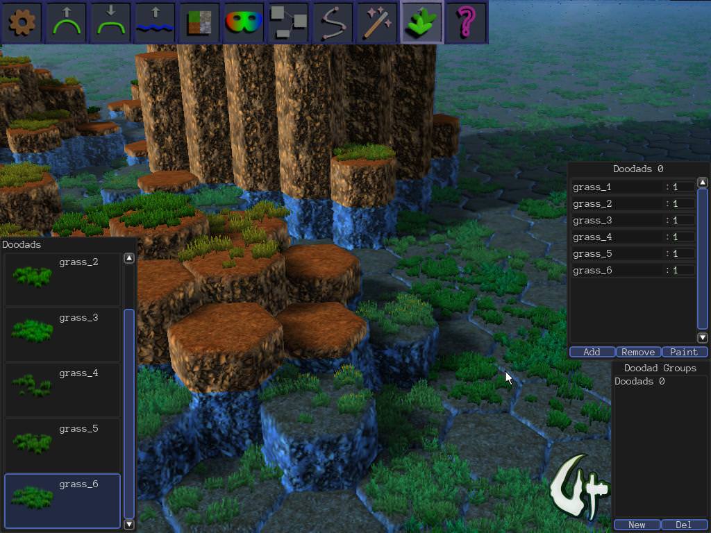
I agree that the original unfiltered version looks best,
but
I also think some color mapping could make it even better!
As I understand it, setting sRGB in Graphics has the same effect as adding the gamma correction post-process filter. (The first uses the graphics hardware, while the second uses software and loses some precision) If you use both you’ll get a double correction.
Assuming all your textures are in the sRGB color space (they almost certainly are), the “correct” thing to do would be:
-
Enable sRGB on all your textures (is there a quick way to do that?)
-
Enable sRGB output on Graphics
That way, the textures will be converted from sRGB -> linear as they’re read, the lighting calculations will use linear colors, and the results will be converted from linear -> sRGB so they look right on screen.
Your lighting values will need to be changed, probably reduced a lot, because they’ll be interpreted as linear rather than sRGB values. For example 50% gray (
#808080
) is fairly dark in sRGB, but looks much lighter as a linear color.
Here’s a great article that helped me get my head around sRGB vs linear lighting:
http://filmicworlds.com/blog/linear-space-lighting-i-e-gamma/
Not doing any color mapping generally looks OK because both textures and screens are generally sRGB. It’s only when you start alpha-blending or doing lighting calculations that the results aren’t quite right.
Overall, though, you should definitely go with whatever looks best, whether it’s “correct” or not!
